The Library of Unsent Letters
Seals, Settings, and Stats
Update Release
Hi friends,
I said the last update might be the last big one. I was wrong, in a good way. The Library has seals now, a second song for closing time, a proper settings menu, and it finally does the thing I wanted it to do from the start: it can quietly show you how other readers carried the same letters, if you ask it to. It also went through a long accessibility pass, so it should work for more people, in more ways, than it did before.
✉️ Seals
Every envelope now has its own small seal, a line drawing pulled from something the letter itself mentions. A comet. A houseplant. A battery running low. A ghost. You'll see the seal on the envelope card in the reading room and again, faint, in the corner of the letter once you open it. Twelve letters, twelve seals, no two alike.
The reading room cards were redesigned around them: seal on the left, the "To:" tag beside it, and the whole card is the link. What's inside stays a surprise until you open it.
📜 Marks along the way
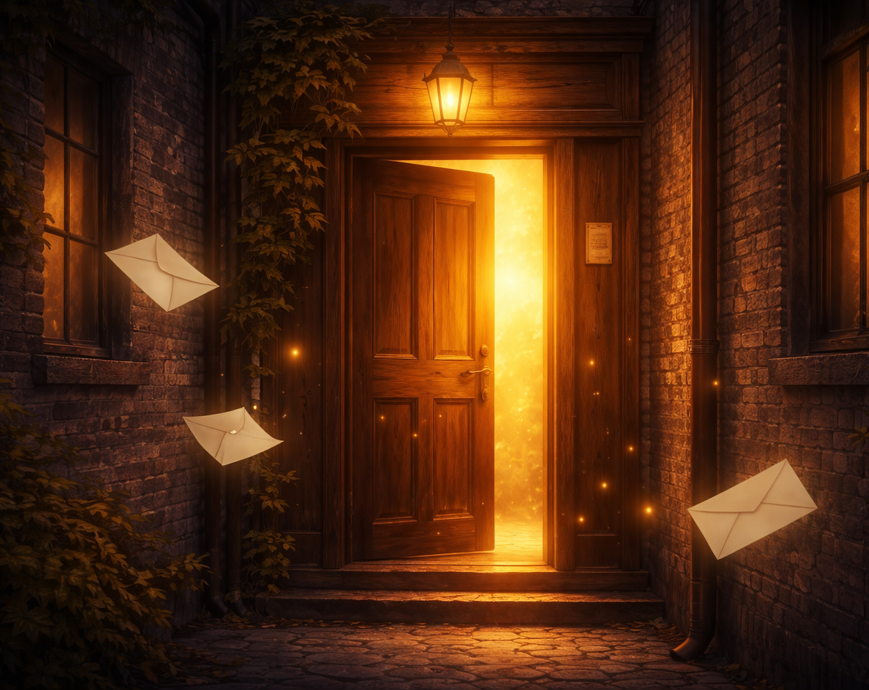
Deliver, Rewrite, and Archive each have a mark now (a paper plane, a page, an archive box). The choices under each letter are proper rows you can tap anywhere, the rewrite options match them, and the large mark sits at the top of the page that follows, so you always know which path you took. Three envelopes drift around the plaque on the landing page.
🎶 Closing time
There's a second song. When the last of the twelve envelopes leaves the table, the theme fades out over a few seconds and "Closing Time at the Branch" fades in underneath it, from the same album. The sidebar tells you which song playing, and the label changes with your clock: this morning's song, this afternoon's, this evening's, tonight's.
🕯️ How others carried the letters
After you've handled your first letter, the Library asks a question: would you like to know how others carried them? Say yes and a section appears at the bottom of the reading room, below the envelopes, with one line of prose for each letter you've handled. Once you've been through all twelve, a few plain numbers join it: how many total letters were delivered as written, rewritten, or archived, and how many readers finish the whole set.
Say no and nothing appears. You can change your mind either way in Settings. It only works with an internet connection, and nothing is ever shown on a letter page itself. Counting started fresh with this release, so earlier plays aren't in it.
What it counts: which letter, which action, and how long it took, plus whether you're on a phone or a computer and which accessibility settings were on. No accounts, no cookies, no IP addresses, nothing stored on your device.
⚙️ Settings
There's a Settings button under Restart now, with three things in it:
- Text size: Normal, Large, or Larger. Everything scales together, sidebar included, and the game now respects your browser's own text size instead of forcing its own.
- Others' choices: the reading room section above, on or off.
- Reduce motion: turns off fades, the drifting envelopes, and the glow. The game also follows your system setting on its own.
♿ Accessibility
This is the part I'm proudest of and the part you may never notice, which is the point.
- Every screen and popup was measured for contrast and passes.
- The whole game works by keyboard: Tab through the envelopes and choices, Enter to pick, Escape to close a popup. Focus moves to the new page after every link, and popups keep focus inside and hand it back when they close.
- Screen readers hear each page's heading, each envelope with its seal ("To: my sibling, seal: two mugs, side by side"), and the marks on the outcome pages. Decorative icons stay silent so nothing is read twice.
- Buttons and links are big enough for thumbs, and the layout holds together at the largest text size on a narrow phone.
- Windows High Contrast mode keeps every icon, border, and control visible.
If you use a screen reader and something reads wrong, please tell me.
🧹 Spacing, finally
If you played earlier versions you may have noticed odd empty gaps: above the first line of some pages, between paragraphs and dividers, in the sidebar. Those weren't margins, they were literal blank lines left behind by the game's logic, which is why no amount of styling ever fixed them (don't ask me how many hours of my life I lost to updating the CSS only to find that was never the way to solve the well-known SugarCube spacing issues).
🎨 Small polish
- the sidebar was redesigned: a progress bar, icon rows for delivered, rewritten, and archived, pill buttons, and a volume slider that looks like it belongs there (there was a hideous one before it that we don't talk about anymore)
- Restart and Settings have matching hand-drawn icons
- popups are narrower, keep their rounded corners, and fit on a phone
- the story column sits closer to the sidebar, with less empty space above and below each letter
- a small back-to-top button appears once you've scrolled, since the reading room got a little longer (especially with stats)
- the sidebar starts closed on phones so it doesn't cover the story
💛 Final thoughts
Drawing the seals felt right. A letter deserves a wax seal, even a small one.
Thank you for reading, and for coming back if this isn't your first visit.
The Library will still be here when you return.
It always is.
🌙 Charlie 📚
The Library of Unsent Letters
A soft, queer-tinged story about unsent messages, quiet courage, and the tender art of choosing what to say.
| Status | Released |
| Author | Charlie Ocean (they/them) |
| Genre | Interactive Fiction |
| Tags | Cozy, LGBT, Queer, Relaxing, Short, Story Rich, Text based, Twine, Wholesome |
| Languages | English |
| Accessibility | Color-blind friendly, High-contrast |
Leave a comment
Log in with itch.io to leave a comment.